197: Kitchen Measurements Converter
Like I mentioned last week, I live in the US, so we use an outdated system of measurement for a lot of things. This necessitates charts, and many of those charts are terrible. Here is another effort to make a less-terrible chart for something.

Some standard disclaimers follow…
This chart is fairly accurate depending on your definitions of these things.
The icons just refer to the colloquial name of those objects, because (of course) a UK “pint” glass is about 20% larger than the US version, and a tea”cup” is usually about 1/2 to 2/3 the size of a standard US measuring cup.
Not to mention the difference between a “US legal cup” and a “US liquid cup.” Which is that a US legal cup—for use on nutritional information labels and such—was rounded to a nice milliliter equivalent: 240 ml. And that is both different than the legal cup you’ll find elsewhere—like Canada and Australia (250 ml)— and the traditional US liquid cup, which is, like the chart shows, just half a US liquid pint (or about 236.59 ml). Ughhh. There’s so much more. Do you know about dry gallons? This is a mess, guys.
Anyway! There’s the chart.
If, like me, you print and mount this to a wall in your kitchen and find that the little information on the right side is too far away, and would work better if it was on the left side… Here you go:
Read more…196: Decimal equivalents of fractional inches
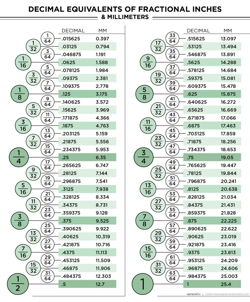
Because I live in the the USA, I typically use the imperial system of measurement (inches, feet, miles, etc.), and as a result, smaller measurements are conducted in fractions of an inch. Fractions are, let’s say, an acquired taste. After years of exposure, I feel pretty comfortable with them. Sometimes I even like them.
But, I often need to reference a conversion chart when I’m making something. I have a JPG file right on my computer desktop. But the layout isn’t quite effortless enough to decipher. There are thousands of these charts available online, but somehow, I can never seem to find one with all the features I want.
- Shaded alternate lines for legibility.
- Offset fraction indents, denoting subdivisions.
- Larger font/darker color for more common fractions.
- Using color at all, or at least shading.
- Maximum of 2 columns. (Some of these things are arranged in a 3-column layout. That’s madness. Inches and thirds don’t get along )
- Legible. (Not a copy of a copy of a copy.)
- Millimeter equivalents included.
- No leading zero on the decimals. (It may seem like a trivial thing, but the amount of times I’ve taken a quick glance and mistaken 0.125 for .0125 makes it worth the trouble. It’s a decimal chart. I know they’re decimals. Get rid of that zero.)
- Accuracy. (The chart I frequently use has a typo, and several of these charts don’t bother with rounding up the third decimal point. 21/32″ = 16.66875 mm. 16.668 mm? I don’t think so!)
So, I made my own. I decided to go with the classic ledger sheet colors. Green makes it seem more official and tool-like. It’s a very useful reference tool, and it can even help you conquer any issues you have with fractions. The indents correspond to tick marks on the ruler, so you can kind of fake it while measuring, and think, “The line in-between 3/4ths and 7/8ths,” then check the chart, and go, “Oh, 13/16ths!”
13/16ths… Yeah. I’m not going to argue. Metric is a much better option.
But, that’s a topic for another day!
Click the pic for a printable PDF. Print it out and hang it up on the wall. It’s great.
195: Another pinwheel of things
I had so much fun making the last one, I made another.
Posted here for easier studying again, as Instagram kills the resolution.

(clicky for biggy)
194: Pinwheel of things
Posted here for easier studying, as Instagram kills the resolution.

(clicky for biggy)
193: Mask Instructions
After watching a few videos and trying out about 4 designs, I settled on these modified instructions.
There is no elastic in this design, primarily because I didn’t have any at the time. I thought that tying the cord would be an annoying step, but I found that, once I sized the cord to my head, I didn’t have to untie it. I could quickly take it off and on by sliding the loop over my head.

For the wire, I actually used a piece of 12-gauge Romex electrical wire, which is probably overkill, and I know not everybody has some laying around, so I didn’t include that in the illustration. But I’d definitely recommend going for a more rigid wire than a twist tie (hence my recommending two). It takes some finesse to bend it right, but once you dial it in, the fit is very secure. Your cheekbones take the load, and you don’t get a squished-flat nose.
Oh yeah. I suppose I should mention, the instructions assume you have a sewing machine, and thread.

192: Crosswords
Welp. We’re all inside for a bit, so how about some activities to keep your minds active?

I’ve been making some crosswords recently, and I guess now is the perfect time to share them.
- You can download them as a PDF, to print and solve.
- Or download the .PUZ file to use in your favorite desktop puzzle program (I like Across Lite).
- Or solve online! I uploaded a few to CrosswordHobbyist.com so you can solve online. (There are some limitations to the site, so they’re not all available there.)
OK. So before I let you at them, I should mention: I’m still a bit of a crossword novice, so while these are playable, and I’m reasonably certain they’re free of errors, they might be a little rough.
Between Us

PDF — .PUZ — Online — Solution
Blow the House Down

PDF — .PUZ — Online — Solution
Dig Deep

PDF — .PUZ — Online — Solution
Lands of the Lost

PDF — .PUZ — Online — Solution
Mid-Forties

PDF — .PUZ — Online — Solution
Money Management

PDF — .PUZ — Online — Solution
Really Coming Down

Save Room

PDF — .PUZ — Online — Solution
Thanksgiving

PDF — .PUZ — Online — Solution
Whiplash!

PDF — .PUZ — Online — Solution
If you do try them, let me know how you did, and certainly leave a comment below if you spot any errors, or anything like that. Just easy on the spoilers, OK?
191: Battery Cover
Hey folks.

I bought this nice tuner/metronome at a thrift store for… $3 maybe? I forget exactly. It was cheap, though. It works perfectly, but it’s missing a battery cover.

Well, it was missing a battery cover. I replaced it, and now with this sleek wood-grain accessory, my little tuner is the envy of all his friends.

I wasn’t sure this was going to work at all, so I didn’t take any progress shots, but here are a few closeups of the final product.


Isn’t it too thin? Won’t it break?
Yes. Probably.
The shininess you see is a coating of polyurethane and superglue, in an attempt at strengthening it. Seems to be working OK. I also made sure the wood-grain ran in the same direction as the tabs, which would have been a great idea, if the tabs didn’t have to be cut so deep.
At the finished depth, the tabs are completely offset from the plane of the main body. So yes, two broke off and I glued them back on. They’re holding this time. I only really need one, anyway.

I obviously couldn’t make it as thin as the plastic would have been, but I got pretty close. The wood sticks out around the edges a bit, and in a couple places, where I needed thin tabs, I resorted to gluing on bits of plastic from some snack packaging.

It holds the batteries in, though.
Sure. The tape I was using before worked, too. But, this is… cooler? And, it gave me an opportunity to do some intricate chisel work — that became x-acto work as it progressed.
It seems like the new piece is strong enough, and the main thing this tuner does is sit still, so it’s probably fine. But, if it breaks I’ll just go back to using some tape.
BYEE!
190: “Hey Jude” Flowchart

My dad sent me an email forward.
Which you’ve seen—I’m sure. I know I have. But that’s what forwards are for, right?
However, there are a whole bunch of errors in that picture, and it reminded me of how frustrated I got the first time I saw it.
So, I started to edit it.
One thing that is particularly glaring to me, is there’s no path to repeat the phrase, “Na na … na na, Hey Jude,” which is pretty much most of the song. You can repeat “Na”, but then to get to “Hey Jude,” you have to go back to the start of the song, and start again. That’s not how the song works.

The timing of this email forward was good for me, as well. I’ve been recently learning about circuitry and logic gates, so I’ve got flowcharts on the mind.
So in the spirit of ruining the joke, I wasted a few hours on this:

I thought about only having one box for “Hey Jude” and one box for “Na,” and just using some interesting logic gates to get in and out of those sections, but I ultimately decided against it for readability. You could, in theory use each word only once, and loop back to them when you need them, but that would get messy. As a compromise I unnecessarily reused “your shoulder.”
I know you’ll be sure to point out any errors. That’s what comment sections are for.
(I didn’t initially make this to post here. I was just completely unable to stop myself, but then I remembered I had this blog. So, here you go, folks.)
189: Transit Elevator Badges
So, like I was saying,
I use public transit a bunch, here in Seattle. It’s great, and since I work at the University of Washington, I get my pass at a discount. So, basically, I’m always on the light rail.
I’ve noticed, however, a frustrating lack of signage. At least once a day, I’ll need to help someone find their way, or tell them which way is North, or how to use the card scanner. But, the thing that consistently confuses the most people, is the elevator buttons at the UW station.
First, a comparison.
Here are the buttons from a couple of elevators elsewhere on the light rail line:

Easy enough. The Mount Baker Station’s train is elevated; the Beacon Hill train is underground.
Plaza, Train. It’s not perfect. There aren’t any pictures, for people who don’t read (or don’t read English), but there are only two buttons, and they’re labelled. Good enough.
This one from the Capitol Hill Station is a bit rough:

OK, so what’s going on here? No more words, only letters. The only letter I see from before is P, so that must be the Plaza, so is S the train?
Nope. S is “Street.” M is “Mezzanine,” because this part of the station has two offset levels, and you switch elevators between them (That’s not a complaint, really. Sometimes that’s the only way.).
And P is for “Platform.” Of course. As in “Train Platform.”
What’s that you say? “P almost always means ‘Parking,’ especially when it’s underground. And anyway, you already used it for ‘Plaza.’ and nobody uses the term ‘Platform.'”?
That’s true.
Consistency would help. Words would help. And pictures would help immensely.
But again, only two buttons on the upper elevator, and not as many people use this one, so… You know, I was planning on ramping up the badness of the examples to reveal the UW elevator buttons, but this is really bad. Equally as bad as the next; maybe worse. I’ll probably deal with this in a bit, but I guess it doesn’t directly affect my life in as much of a way, so I didn’t do it this week.
On to the one I did do:

This one’s a mess.
We’re cheating a bit, because I already told you that P is “Platform,” and S is “Street,” like in Capitol Hill. M is still “Mezzanine, but this level is inaccessible without a key or keycard. Maybe M is “Maintenance” at this station. Who knows? B3 is “Basement 3,” maybe? I have no idea, because there’s no Basement 2, even if I count the Mezzanine as Basement 1. Also inaccessible to the public.
There are 2 elevators at the UW Station, and this one is the worst. The other elevator omits B3 and M buttons, so it’s an easier choice, but 50/50 you’re getting on this one.
Still, what’s BR? Well that’s “Bridge,” and you might be thinking, “I could figure that out!” OK, but why is helpful to know it’s a bridge? A bridge to where? (Don’t say Terabithia.) It’s a pedestrian bridge that crosses a busy street into the UW campus. (Which some people who ride it daily still don’t know. I see people get off at the street level, and then take the stairs up to the bridge. Maybe they like stairs, but that’s like taking the elevator to the 5th floor of a building and walking to the 6th. Whatever.)
What makes it worse is that there is very little signage indicating that the light rail station is underground, especially if you’re on the bridge.
The scenario I see most frequently is: someone unfamiliar with the system will enter on the bridge level, think, “Uhhhhh…” and press S, because it has a star next to it. Then it will open on the street, and that person will get off, wander around, and eventually get back on the elevator. If nobody’s around again (or if someone is around, but being particularly unhelpful and only observing the confusion, like a scientist or jerk might do), they’ll think “Well, it’s not Parking,” and B3 is a terrifying option to even think about. So, they’ll mash M for “Maybe Train?” and the button light will come on and immediately turn back off. At which point, I usually help out.
If they initially get in on the street level, they will often take the elevator up to the bridge, and be just as confused.
So, what’s to be done?

This.
I printed up some placards. They’ve got full names, descriptions, and most importantly (I think), pictures! They also have Sound Transit logos on them, because I was banking on the idea that if they looked official, they might stay up.
I didn’t make one for B3, because I don’t know what it is. And, it’s not important for the public to know. And also, I wasn’t looking at my photos when I made these, and forgot B3 was a button.
One of those reasons.

Cut, laminated, mounted to some sturdy double-sided tape, and ready to go.

Ta-dah! This is a picture of the other elevator at UW Station (the 3-button one). I put them up in both, but only got a picture of this one.
I think it’s an improvement. I don’t have braille on mine, because I don’t-know/can’t-print braille, so it’s not perfect. But then again, I’m not a professional sign-maker. Please ignore the alignment issues. I was installing them within a time limit of about 15 seconds, and I messed it up. If someone would like to do it better, please do! You can do Capitol Hill while you’re at it. I didn’t make a comprehensive sweep of elevators, so I’m sure there are others that need help, too.
By the way, the above picture is from a about a week after I put them up! They’re still up! We did it!
Well, that was alright.
Next up, maybe some signs that say, “Both trains go the same direction from this station” to put up at the end-of-the-line stations. That seems to confuse people to no end.
…Or probably something to tell people to tap their ORCA pass card at the end of their ride, too.
Yeah. Hey, Seattle! If you’re reading this, tap your ORCA card off at the end of your ride! It’s a switch! It works differently than the buses. Your ticket costs less if you ride it a shorter distance, but if you don’t tap off, you pay the maximum price! Also, if you don’t tap off, the next time you ride, your tap ON might register as a tap OFF from last time. Then you’re riding illegally, and you’ll get a fine. Not to mention the user data! If nobody taps off at your station, the data looks like nobody uses that station, so maybe it’s not as important for upkeep and funding. Come on, folks!
Sorry about that. (Not sorry enough to not do it, apparently.)
Also, Sound Transit: I do this out of love. A good friend will tell you when you’re doing something wrong. I love the light rail, and I hope you understand and we’re cool.
Have a nice week.
UPDATE!
They stayed up for a very long time, and were eventually replaced with official labels!
Wooooooo!
Thanks folks, you did it!
188: Boombox Pillow
This project happened a while ago, but I had some file storage problems and lost pretty much all of the process photos. So, I delayed posting for a while. I’ve finally come to terms with the fact that they’re gone forever, so this post is cobbled together from what I do have (…which are mostly finished product shots).
A friend of mine, Michelle Dirkse, is a designer. She asked me to make a plush sculpture for her, and she would provide the fabric. I said, “Of course!”

When I learned that she wanted a big fuchsia boombox, I was even more excited. But, I, unlike many people, had never created a pillow shaped like an ’80s magenta music machine, so I honestly wasn’t quite sure where to begin. (That never really stops me from saying yes to a project, though.)

I sent her a picture of an idea, and she sent some suggestions back. Then I got to work.
The fabric showed up, and it was really, really nice. I just wanted to wrap myself up in it and go to sleep, but I resisted the urge. I tend to work with whatever is at hand. So, this fabric was a refreshing change from the usual bed sheets, cheap fleece, and thrift store sweaters.

I really like the colors we decided on. It’s all done in a single color of fuchsia fabric with a matching, shade-lighter thread and a few accents in black thread. It looks sharp! The texture on those speakers took forever, just sewing (roughly) parallel lines, back and forth. A standard cassette tape will stay snugly lodged in the tape area–which is probably the best use for your high school mixtape.
There were a lot of windows to cut out of the main form, to reveal a layer underneath. I found the best way to get a nice edge on a cut-out window is to use this method:

…Then it’s ironed and gets a top-stitch all the way around to crisp everything up, and attach the layer below. My top-stitching isn’t perfect, and that’s fine for a project where you’re emphasizing the hand-made aspect of it.

Also, the padding is mostly latex foam, which is notoriously difficult to cut without a fancy hot-wire setup. I looked around for other cutting options and saw someone suggesting an electric turkey knife. So, I hit the clearance section of the local grocery store and found one for about $9. It was amazing! The electric turkey knife was so effortlessly fun to cut with, I went out and bought more latex foam for some other project in the future. I don’t even know what I’ll do with it, yet, but I can’t wait to cut more foam.

Oh right, I nearly forgot. I clearly didn’t take those awesome pictures myself (except the drawings). Michelle knows real professionals, so the cool, clean product shots are by Nathaniel Willson Photography, and the beautiful portraits of Michelle and the boombox are by Zoe Rain Photography. And if you want to go check out my high-end sculpture in a nice gallery setting, stop by Michelle Dirkse Interior Design in Capitol Hill, Seattle, or–you know–click here.


